Introduction
In many real-world scenarios, data is generated in massive quantities without any predefined labels or annotations. From user behavior on websites and sensor readings in IoT systems to images, text documents, and biological data, the majority of information available today is unlabeled. This is where unsupervised learning plays a critical role in modern data science and machine learning.
Unsupervised learning refers to a class of algorithms that aim to discover hidden structures, patterns, and relationships within data without relying on known outputs. Unlike supervised learning, where models learn from examples with explicit labels, unsupervised learning allows machines to organize, summarize, and interpret data autonomously. These techniques are fundamental for exploratory data analysis, knowledge discovery, and as preprocessing steps for more advanced learning pipelines.
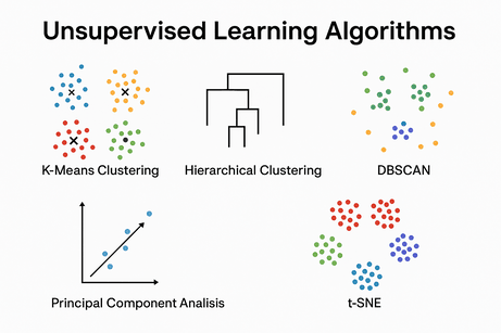
One of the most common applications of unsupervised learning is clustering, where the goal is to group similar data points together based on their intrinsic characteristics. Clustering algorithms help answer questions such as: Which customers behave similarly? Which documents discuss related topics? Which sensors exhibit comparable patterns? In this tutorial, we will explore some of the most widely used clustering techniques, including K-Means, Hierarchical Clustering, and DBSCAN, each offering a different perspective on how similarity and structure can be defined in data.
Beyond clustering, unsupervised learning also plays a key role in dimensionality reduction. Real-world datasets often contain a large number of features, making them difficult to visualize, interpret, or process efficiently. Techniques such as Principal Component Analysis (PCA) and t-SNE allow us to reduce high-dimensional data into lower-dimensional representations while preserving meaningful information. These methods are especially valuable for data visualization, noise reduction, and improving the performance of downstream machine learning models.
Throughout this tutorial, we adopt a practical and intuitive approach. Each algorithm is introduced with a clear conceptual explanation, followed by Python implementations using popular machine learning libraries such as NumPy, Scikit-learn, and Matplotlib. Visualizations are used extensively to help you understand how these algorithms operate internally and how they transform data in practice. Rather than focusing solely on theory, the emphasis is on building a strong conceptual intuition supported by hands-on examples.
This tutorial is designed for students, engineers, researchers, and practitioners who have a basic understanding of Python and want to deepen their knowledge of machine learning. Whether you are exploring data for the first time, preparing features for a supervised model, or visualizing complex datasets, mastering unsupervised learning techniques is an essential step in your machine learning journey.
By the end of this guide, you will have a solid understanding of how unsupervised learning algorithms work, when to use each method, and how to apply them effectively to real-world datasets. These skills form a foundational pillar of modern data science and will prepare you to tackle more advanced topics such as representation learning, anomaly detection, and deep unsupervised models in future lessons.
1️⃣ What Is Unsupervised Learning?
Unsupervised Learning deals with data without labeled outputs.
The goal is to discover hidden patterns, structures, or representations in the data.
Typical tasks:
- Clustering (grouping similar samples)
- Dimensionality reduction
- Anomaly detection
- Data visualization
2️⃣ K-Means Clustering
🔹 Intuition
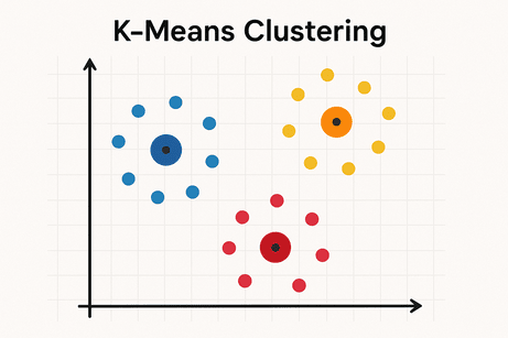
K-Means groups data into K clusters by minimizing the distance between data points and their cluster centroid.
Algorithm steps:
- Choose K centroids randomly
- Assign each point to nearest centroid
- Update centroids (mean of assigned points)
- Repeat until convergence
🔹 Mathematical Idea (Light)
Objective function:
$J = \sum_{i=1}^{K} \sum_{x \in C_i} ||x - \mu_i||^2$
Where:
- $C_i$: cluster i
- $\mu_i$: centroid of cluster i
🔹 Python Example (with Visualization)
import numpy as np
import matplotlib.pyplot as plt
from sklearn.cluster import KMeans
from sklearn.datasets import make_blobs

# Generate data
X, _ = make_blobs(n_samples=300, centers=4, random_state=42)

# Train model
kmeans = KMeans(n_clusters=4, random_state=42)
labels = kmeans.fit_predict(X)

# Plot
plt.scatter(X[:, 0], X[:, 1], c=labels)
plt.scatter(kmeans.cluster_centers_[:, 0],
            kmeans.cluster_centers_[:, 1],
            marker='x')
plt.title("K-Means Clustering")
plt.show()
🔹 Pros & Cons
✅ Simple & fast
❌ Must choose K
❌ Sensitive to outliers
❌ Assumes spherical clusters
🔹 Use Cases
- Customer segmentation
- Image compression
- Market analysis
3️⃣ Hierarchical Clustering
🔹 Intuition
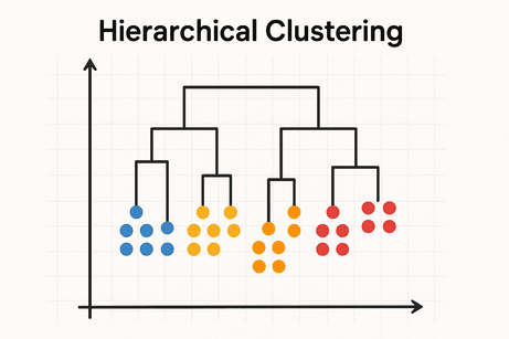
Builds a tree of clusters (dendrogram) showing how samples group together.
Types:
- Agglomerative (bottom-up)
- Divisive (top-down)
🔹 Distance Metrics
- Euclidean
- Manhattan
- Cosine
Linkage methods:
- Single
- Complete
- Average
- Ward
🔹 Python Example (Dendrogram)
import matplotlib.pyplot as plt
from scipy.cluster.hierarchy import dendrogram, linkage
from sklearn.datasets import make_blobs

X, _ = make_blobs(n_samples=100, random_state=42)

Z = linkage(X, method='ward')

plt.figure(figsize=(10, 5))
dendrogram(Z)
plt.title("Hierarchical Clustering Dendrogram")
plt.show()
🔹 Pros & Cons
✅ No need to predefine clusters
✅ Interpretable hierarchy
❌ Computationally expensive
❌ Sensitive to noise
🔹 Use Cases
- Biology (gene analysis)
- Document clustering
- Social network analysis
4️⃣ DBSCAN (Density-Based Clustering)
🔹 Intuition
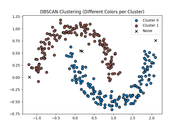
Clusters are formed by dense regions of data.
Points in sparse regions are labeled as noise.
Key parameters:
- ε (eps) → neighborhood radius
- min_samples → minimum points to form a cluster
🔹 Concept
- Core point → enough neighbors
- Border point → near core
- Noise → isolated
🔹 Python Example
from sklearn.cluster import DBSCAN
from sklearn.datasets import make_moons
import matplotlib.pyplot as plt
import numpy as np

# Generate data
X, _ = make_moons(n_samples=300, noise=0.1)

# DBSCAN
dbscan = DBSCAN(eps=0.2, min_samples=5)
labels = dbscan.fit_predict(X)

# Unique labels (clusters)
unique_labels = set(labels)

# Create a colormap
colors = plt.cm.tab10(np.linspace(0, 1, len(unique_labels)))

plt.figure(figsize=(7, 5))

for label, color in zip(unique_labels, colors):
    if label == -1:
        # Noise points in black
        color = "black"
        marker = "x"
        label_name = "Noise"
    else:
        marker = "o"
        label_name = f"Cluster {label}"

    plt.scatter(
        X[labels == label, 0],
        X[labels == label, 1],
        c=[color],
        marker=marker,
        label=label_name,
        edgecolors="k",
        s=50
    )

plt.title("DBSCAN Clustering (Different Colors per Cluster)")
plt.legend()
plt.show()
🔹 Pros & Cons
✅ Finds arbitrary shapes
✅ Detects outliers
❌ Sensitive to parameter choice
❌ Struggles with varying densities
🔹 Use Cases
- Anomaly detection
- Geographic data
- Fraud detection
5️⃣ Principal Component Analysis (PCA)
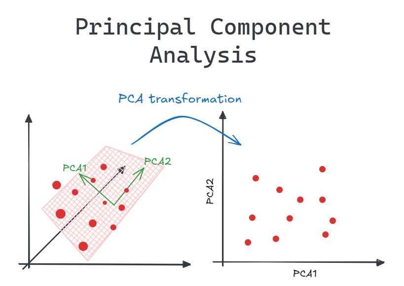
🔹 Intuition
PCA reduces dimensions while preserving maximum variance.
Transforms data into orthogonal components (principal axes).
🔹 Mathematical Idea
- Compute covariance matrix
- Find eigenvectors & eigenvalues
- Project data onto top components
🔹 Python Example
from sklearn.decomposition import PCA
from sklearn.datasets import load_iris
import matplotlib.pyplot as plt

X, y = load_iris(return_X_y=True)

pca = PCA(n_components=2)
X_reduced = pca.fit_transform(X)

plt.scatter(X_reduced[:, 0], X_reduced[:, 1], c=y)
plt.title("PCA Projection")
plt.show()
🔹 Pros & Cons
✅ Noise reduction
✅ Visualization
❌ Loss of interpretability
❌ Linear method only
🔹 Use Cases
- Feature reduction
- Visualization
- Preprocessing before clustering
6️⃣ t-SNE (Conceptual Overview)
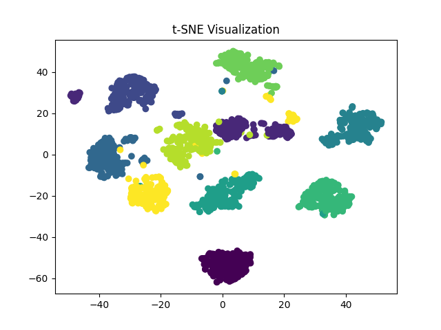
🔹 Intuition
t-SNE maps high-dimensional data to 2D or 3D, preserving local similarity.
Key idea:
“Points close in high-D space remain close in low-D space.”
🔹 Important Notes
- Not for training models
- Used mainly for visualization
- Computationally expensive
🔹 Python Example
from sklearn.manifold import TSNE
from sklearn.datasets import load_digits
import matplotlib.pyplot as plt

X, y = load_digits(return_X_y=True)

tsne = TSNE(n_components=2, random_state=42)
X_tsne = tsne.fit_transform(X)

plt.scatter(X_tsne[:, 0], X_tsne[:, 1], c=y)
plt.title("t-SNE Visualization")
plt.show()
🔹 PCA vs t-SNE
| Feature | PCA | t-SNE |
|---|---|---|
| Linear | Yes | No |
| Speed | Fast | Slow |
| Interpretability | Medium | Low |
| Visualization | OK | Excellent |
7️⃣ Summary Table
| Algorithm | Type | Main Goal |
|---|---|---|
| K-Means | Clustering | Compact groups |
| Hierarchical | Clustering | Cluster hierarchy |
| DBSCAN | Clustering | Density & outliers |
| PCA | Reduction | Variance preservation |
| t-SNE | Visualization | Local structure |










💬 Comments
No comments yet. Be the first to comment!
Login to comment.