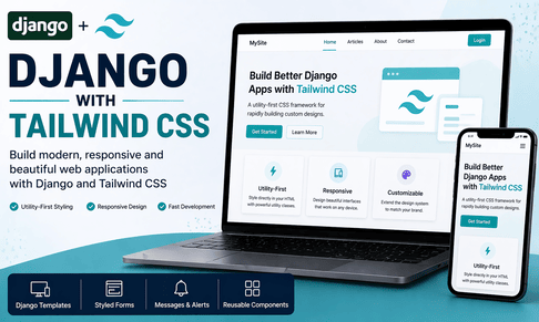
Django with Tailwind CSS is one of the most modern and powerful combinations for building beautiful web applications without leaving the comfort of Django’s template system. Django gives you a strong backend architecture with routing, models, forms, authentication, admin tools, template rendering, and security. Tailwind CSS, on the other hand, gives you a utility-first approach to frontend design, allowing you to build custom, responsive, professional interfaces directly inside your HTML. Instead of relying on large prebuilt UI styles, Tailwind lets you construct your own designs using small reusable utility classes for spacing, typography, colors, borders, layout, responsiveness, states, and animations. This approach gives Django developers much more control over the visual appearance of their applications while still working inside the server-rendered template model.
For many years, Django developers often relied on Bootstrap because it was quick and convenient. Bootstrap remains useful, but Tailwind has become extremely popular because it provides much more design flexibility. Bootstrap gives ready-made components with predefined styles, while Tailwind gives design primitives. In practice, this means Bootstrap helps you build fast with a familiar look, while Tailwind helps you build custom interfaces without writing large CSS files. For Django developers who want more modern UI design, cleaner aesthetics, and tighter control over layout and branding, Tailwind is often a better fit. It feels especially powerful when you are building dashboards, blogs, SaaS interfaces, content platforms, admin panels, learning portals, and product websites where design consistency matters.
One of the most important things to understand is that Tailwind CSS does not replace Django templates. Tailwind works inside them. Django still handles the backend logic, fetches data from the database, validates forms, processes authentication, renders templates, and serves the final page. Tailwind simply styles what Django renders. So just like Bootstrap, Tailwind complements Django rather than competing with it. The difference is in the styling philosophy. Tailwind encourages you to compose your UI directly in the HTML using utility classes such as flex, grid, px-4, py-2, rounded-xl, shadow-sm, text-gray-700, bg-blue-600, hover:bg-blue-700, and md:grid-cols-2. These classes may look verbose at first, but they lead to very fast and highly maintainable design once you understand the system.
The main advantage of Tailwind in Django is that it removes the need to constantly move between HTML and CSS files for common styling tasks. If you want a card with padding, shadow, border radius, white background, and responsive spacing, you can build it directly in the template with utilities. If you want a button to turn darker on hover and have a smooth transition, you can do that directly in the HTML. This results in a workflow that is extremely productive. Instead of inventing custom class names like main-card, homepage-button, or custom-form-box, then defining them in CSS, Tailwind encourages you to define appearance where the markup lives. That makes templates very expressive and makes design decisions easier to see.
Let us start with the conceptual integration. A Django app typically has templates, static files, views, models, forms, and URL routing. Tailwind CSS usually enters the project through the frontend build pipeline. Unlike a simple Bootstrap CDN link, Tailwind is generally installed and compiled so that only the CSS classes you actually use are included in the final stylesheet. This makes the final CSS output much smaller and more optimized. It also means Tailwind is better suited to production quality projects when configured correctly.
A common Django project structure with Tailwind might look like this:
myproject/
│
├── manage.py
├── package.json
├── tailwind.config.js
├── postcss.config.js
├── myproject/
│   ├── settings.py
│   ├── urls.py
│   └── ...
│
├── core/
│   ├── views.py
│   ├── forms.py
│   ├── models.py
│   ├── urls.py
│   └── ...
│
├── templates/
│   ├── base.html
│   └── core/
│       ├── home.html
│       ├── contact.html
│       └── article_list.html
│
└── static/
    ├── src/
    │   └── input.css
    └── css/
        └── output.css
This structure can vary, but the idea is simple: Tailwind reads a source CSS file, scans your templates for utility classes, and builds an optimized CSS file that Django serves as a static asset. In development, Tailwind watches your files and updates CSS whenever you change templates. In production, you compile a final minimized stylesheet.
A very common and practical installation flow is to use Node.js with Tailwind CLI. First, in the root of your Django project, initialize Node and install Tailwind:
npm init -y
npm install -D tailwindcss postcss autoprefixer
npx tailwindcss init
This creates package.json and tailwind.config.js. Then create a file called static/src/input.css:
@tailwind base;
@tailwind components;
@tailwind utilities;
Now configure tailwind.config.js so Tailwind scans your Django templates and Python files where classes may appear:
/** @type {import('tailwindcss').Config} */
module.exports = {
  content: [
    "./templates/**/*.html",
    "./**/templates/**/*.html",
    "./**/*.py",
  ],
  theme: {
    extend: {},
  },
  plugins: [],
}
The content section is extremely important. Tailwind removes unused classes during the build process, so it must know where your templates live. If you forget to include the correct template paths, your CSS may compile without the classes you expect, and your design will appear broken. Many beginners think Tailwind is not working when the real problem is that the content paths are wrong.
Next, add a build command in package.json:
{
  "scripts": {
    "build-css": "tailwindcss -i ./static/src/input.css -o ./static/css/output.css --watch"
  }
}
Now run:
npm run build-cssThis command watches your templates and continuously builds the final CSS file. In production, you would use a non-watch build command with minification, but for development this is enough.
Once the CSS file is generated, include it in your Django base template. Make sure static files are configured properly in settings.py:
from pathlib import Path

BASE_DIR = Path(__file__).resolve().parent.parent

STATIC_URL = "/static/"
STATICFILES_DIRS = [BASE_DIR / "static"]

TEMPLATES = [
    {
        "BACKEND": "django.template.backends.django.DjangoTemplates",
        "DIRS": [BASE_DIR / "templates"],
        "APP_DIRS": True,
        "OPTIONS": {
            "context_processors": [
                "django.template.context_processors.request",
                "django.contrib.auth.context_processors.auth",
                "django.contrib.messages.context_processors.messages",
            ],
        },
    },
]
Then create templates/base.html:
{% load static %}
<!DOCTYPE html>
<html lang="en">
<head>
    <meta charset="UTF-8">
    <meta name="viewport" content="width=device-width, initial-scale=1.0">
    <title>{% block title %}My Django Tailwind Site{% endblock %}</title>
    <link rel="stylesheet" href="{% static 'css/output.css' %}">
</head>
<body class="bg-gray-50 text-gray-800 min-h-screen flex flex-col">

    <nav class="bg-white border-b border-gray-200 shadow-sm">
        <div class="max-w-7xl mx-auto px-4 sm:px-6 lg:px-8">
            <div class="flex justify-between items-center h-16">
                <a href="/" class="text-xl font-bold text-blue-600">MySite</a>

                <div class="hidden md:flex items-center space-x-6">
                    <a href="/" class="text-gray-700 hover:text-blue-600 transition">Home</a>
                    <a href="/articles/" class="text-gray-700 hover:text-blue-600 transition">Articles</a>
                    <a href="/contact/" class="text-gray-700 hover:text-blue-600 transition">Contact</a>
                </div>
            </div>
        </div>
    </nav>

    <main class="flex-1">
        <div class="max-w-7xl mx-auto px-4 sm:px-6 lg:px-8 py-10">
            {% block content %}{% endblock %}
        </div>
    </main>

    <footer class="bg-white border-t border-gray-200 mt-12">
        <div class="max-w-7xl mx-auto px-4 sm:px-6 lg:px-8 py-6 text-center text-sm text-gray-500">
            © 2026 My Django Tailwind Site
        </div>
    </footer>

</body>
</html>
This is where the style difference between Bootstrap and Tailwind becomes obvious. Instead of using predefined components like navbar, container, or btn btn-primary, you build the design directly with utilities. The body is set to a light gray background with dark text. The navbar uses a white background, subtle border, and shadow. The layout width is controlled by max-w-7xl mx-auto, while padding comes from px-4 sm:px-6 lg:px-8. Responsive behavior is handled using breakpoint prefixes like md: and lg:. This utility-first structure gives you full control without requiring a separate CSS file for most design decisions.
Now let us create a home page template to see how Tailwind works in practice:
{% extends "base.html" %}

{% block title %}Home{% endblock %}

{% block content %}
<section class="text-center py-12">
    <h1 class="text-4xl md:text-5xl font-extrabold tracking-tight text-gray-900">
        Build Better Django Interfaces with Tailwind CSS
    </h1>
    <p class="mt-4 text-lg text-gray-600 max-w-2xl mx-auto">
        Create modern, responsive, and clean user interfaces directly in your Django templates using utility-first classes.
    </p>
    <div class="mt-8 flex justify-center gap-4">
        <a href="/articles/" class="inline-flex items-center px-6 py-3 rounded-xl bg-blue-600 text-white font-medium shadow hover:bg-blue-700 transition">
            Explore Articles
        </a>
        <a href="/contact/" class="inline-flex items-center px-6 py-3 rounded-xl border border-gray-300 bg-white text-gray-700 font-medium hover:bg-gray-100 transition">
            Contact Us
        </a>
    </div>
</section>

<section class="grid grid-cols-1 md:grid-cols-3 gap-6 mt-12">
    <div class="bg-white rounded-2xl shadow-sm border border-gray-100 p-6">
        <h2 class="text-xl font-semibold text-gray-900">Flexible Design</h2>
        <p class="mt-3 text-gray-600">
            Tailwind helps you create custom designs without relying on rigid prebuilt component styles.
        </p>
    </div>

    <div class="bg-white rounded-2xl shadow-sm border border-gray-100 p-6">
        <h2 class="text-xl font-semibold text-gray-900">Responsive by Default</h2>
        <p class="mt-3 text-gray-600">
            Use responsive utility classes to make your Django pages look great on every screen size.
        </p>
    </div>

    <div class="bg-white rounded-2xl shadow-sm border border-gray-100 p-6">
        <h2 class="text-xl font-semibold text-gray-900">Fast Workflow</h2>
        <p class="mt-3 text-gray-600">
            Build layouts, forms, cards, and navigation directly in templates without writing large CSS files.
        </p>
    </div>
</section>
{% endblock %}
This example reveals the Tailwind mindset. Every piece of spacing, color, typography, border radius, and hover behavior is explicitly described. For some developers, this initially feels crowded, but after some practice it becomes extremely intuitive. You no longer need to wonder where a style was defined because it is visible in the HTML. This leads to faster iteration and often fewer CSS maintenance problems.
To connect this page in Django, the backend is still very simple. In views.py:
from django.shortcuts import render

def home(request):
    return render(request, "core/home.html")
And in urls.py:
from django.urls import path
from .views import home

urlpatterns = [
    path("", home, name="home"),
]
One of the strongest use cases for Tailwind in Django is card-based layouts. Blogs, article listings, products, categories, dashboards, tutorials, and user profiles all benefit from a card UI. Suppose you have an Article model:
from django.db import models

class Article(models.Model):
    title = models.CharField(max_length=200)
    summary = models.TextField()
    created_at = models.DateTimeField(auto_now_add=True)

    def __str__(self):
        return self.title
In views.py:
from django.shortcuts import render
from .models import Article

def article_list(request):
    articles = Article.objects.order_by("-created_at")
    return render(request, "core/article_list.html", {"articles": articles})
And the template:
{% extends "base.html" %}

{% block title %}Articles{% endblock %}

{% block content %}
<div class="mb-8">
    <h1 class="text-3xl font-bold text-gray-900">Latest Articles</h1>
    <p class="mt-2 text-gray-600">Read the most recent content from our Django site.</p>
</div>

<div class="grid grid-cols-1 md:grid-cols-2 xl:grid-cols-3 gap-6">
    {% for article in articles %}
        <article class="bg-white rounded-2xl border border-gray-100 shadow-sm hover:shadow-md transition overflow-hidden">
            <div class="p-6">
                <h2 class="text-xl font-semibold text-gray-900">{{ article.title }}</h2>
                <p class="mt-3 text-gray-600 leading-relaxed">
                    {{ article.summary|truncatewords:24 }}
                </p>
                <div class="mt-5 flex items-center justify-between">
                    <span class="text-sm text-gray-500">{{ article.created_at|date:"M d, Y" }}</span>
                    <a href="#" class="text-blue-600 font-medium hover:text-blue-700">
                        Read more →
                    </a>
                </div>
            </div>
        </article>
    {% empty %}
        <div class="col-span-full bg-yellow-50 border border-yellow-200 text-yellow-800 rounded-xl p-4">
            No articles available yet.
        </div>
    {% endfor %}
</div>
{% endblock %}
This card layout feels much more custom than a generic CSS framework style. You control shadows, borders, spacing, hover behavior, and typography precisely. This is where Tailwind becomes especially appealing for content websites and modern product interfaces. Instead of forcing your pages into predefined component styles, it gives you the tools to create a polished but unique design language.
Forms are another critical part of Django development, and Tailwind works very well with them. Django’s forms provide validation, cleaned data, errors, widgets, and integration with models, while Tailwind lets you style them exactly as you want. A contact form is a good example. In forms.py:
from django import forms

class ContactForm(forms.Form):
    name = forms.CharField(
        max_length=100,
        widget=forms.TextInput(attrs={
            "class": "w-full rounded-xl border border-gray-300 px-4 py-3 text-gray-800 focus:outline-none focus:ring-2 focus:ring-blue-500 focus:border-blue-500",
            "placeholder": "Your name"
        })
    )
    email = forms.EmailField(
        widget=forms.EmailInput(attrs={
            "class": "w-full rounded-xl border border-gray-300 px-4 py-3 text-gray-800 focus:outline-none focus:ring-2 focus:ring-blue-500 focus:border-blue-500",
            "placeholder": "Your email"
        })
    )
    message = forms.CharField(
        widget=forms.Textarea(attrs={
            "class": "w-full rounded-xl border border-gray-300 px-4 py-3 text-gray-800 focus:outline-none focus:ring-2 focus:ring-blue-500 focus:border-blue-500",
            "rows": 5,
            "placeholder": "Your message"
        })
    )
In views.py:
from django.shortcuts import render, redirect
from django.contrib import messages
from .forms import ContactForm

def contact_view(request):
    if request.method == "POST":
        form = ContactForm(request.POST)
        if form.is_valid():
            messages.success(request, "Your message has been sent successfully.")
            return redirect("contact")
        else:
            messages.error(request, "Please correct the errors below.")
    else:
        form = ContactForm()

    return render(request, "core/contact.html", {"form": form})
Template:
{% extends "base.html" %}

{% block title %}Contact{% endblock %}

{% block content %}
<div class="max-w-2xl mx-auto">
    <div class="bg-white rounded-2xl shadow-sm border border-gray-100 p-8">
        <h1 class="text-3xl font-bold text-gray-900">Contact Us</h1>
        <p class="mt-2 text-gray-600">Send us a message and we will get back to you soon.</p>

        <form method="post" class="mt-8 space-y-6">
            {% csrf_token %}

            <div>
                <label class="block text-sm font-medium text-gray-700 mb-2">Name</label>
                {{ form.name }}
                {% if form.name.errors %}
                    <div class="mt-2 text-sm text-red-600">{{ form.name.errors }}</div>
                {% endif %}
            </div>

            <div>
                <label class="block text-sm font-medium text-gray-700 mb-2">Email</label>
                {{ form.email }}
                {% if form.email.errors %}
                    <div class="mt-2 text-sm text-red-600">{{ form.email.errors }}</div>
                {% endif %}
            </div>

            <div>
                <label class="block text-sm font-medium text-gray-700 mb-2">Message</label>
                {{ form.message }}
                {% if form.message.errors %}
                    <div class="mt-2 text-sm text-red-600">{{ form.message.errors }}</div>
                {% endif %}
            </div>

            <button type="submit" class="inline-flex items-center justify-center rounded-xl bg-blue-600 px-6 py-3 text-white font-medium shadow hover:bg-blue-700 transition">
                Send Message
            </button>
        </form>
    </div>
</div>
{% endblock %}
This example demonstrates how Django and Tailwind combine beautifully. Django handles form rendering and validation, while Tailwind gives you precise styling control. Unlike Bootstrap, where form appearance is often tied to predefined classes such as form-control, Tailwind lets you create a custom input style with exact border, radius, padding, focus ring, and color behavior.
Django’s messages framework also works very well with Tailwind. In your base template, you can render messages with custom utility styles:
{% if messages %}
    <div class="mb-6 space-y-3">
        {% for message in messages %}
            <div class="rounded-xl px-4 py-3 text-sm font-medium
                {% if message.tags == 'success' %}bg-green-50 text-green-700 border border-green-200{% endif %}
                {% if message.tags == 'error' %}bg-red-50 text-red-700 border border-red-200{% endif %}
                {% if message.tags == 'warning' %}bg-yellow-50 text-yellow-700 border border-yellow-200{% endif %}
                {% if message.tags == 'info' %}bg-blue-50 text-blue-700 border border-blue-200{% endif %}">
                {{ message }}
            </div>
        {% endfor %}
    </div>
{% endif %}
This is a great example of Tailwind’s flexibility. Instead of relying on pre-styled alerts, you create your own message styles directly in the template. This makes the interface feel more consistent with your project’s design language.
A major strength of Tailwind in Django is responsiveness. Tailwind’s breakpoint prefixes make it simple to adapt layouts to different screen sizes. For example, a dashboard layout can move from one column on mobile to three columns on desktop:
<div class="grid grid-cols-1 md:grid-cols-2 xl:grid-cols-3 gap-6">
    <div class="bg-white rounded-2xl p-6 shadow-sm border border-gray-100">Card 1</div>
    <div class="bg-white rounded-2xl p-6 shadow-sm border border-gray-100">Card 2</div>
    <div class="bg-white rounded-2xl p-6 shadow-sm border border-gray-100">Card 3</div>
</div>
Here, grid-cols-1 applies on mobile, md:grid-cols-2 on medium screens, and xl:grid-cols-3 on large screens. This fine-grained responsiveness is one of the reasons Tailwind is so appealing for modern web apps.
Another important concept is component extraction. Beginners sometimes think Tailwind forces them to duplicate long class lists everywhere. That can happen if you do not organize your templates well. In real Django projects, you typically solve this by creating reusable partial templates. For example, you can create templates/partials/navbar.html, templates/partials/messages.html, templates/partials/article_card.html, or templates/partials/sidebar.html and include them in larger templates. This keeps the code maintainable while still benefiting from Tailwind’s utility approach.
For example:
{% include "partials/navbar.html" %}
{% include "partials/messages.html" %}
And for an article card:
<article class="bg-white rounded-2xl border border-gray-100 shadow-sm hover:shadow-md transition overflow-hidden">
    <div class="p-6">
        <h2 class="text-xl font-semibold text-gray-900">{{ article.title }}</h2>
        <p class="mt-3 text-gray-600">{{ article.summary|truncatewords:20 }}</p>
        <div class="mt-4">
            <a href="#" class="text-blue-600 hover:text-blue-700 font-medium">Read more →</a>
        </div>
    </div>
</article>
This approach gives you a reusable design system inside your Django templates. It is especially useful for blogs, marketplaces, dashboards, admin tools, and learning platforms where visual consistency matters.
Tailwind also supports custom theme extension. Suppose your brand uses a special blue or a custom font. You can add these to tailwind.config.js:
module.exports = {
  content: [
    "./templates/**/*.html",
    "./**/templates/**/*.html",
    "./**/*.py",
  ],
  theme: {
    extend: {
      colors: {
        brand: {
          DEFAULT: "#2563eb",
          dark: "#1d4ed8",
        },
      },
      fontFamily: {
        sans: ["Inter", "sans-serif"],
      },
    },
  },
  plugins: [],
}
Now you can use classes like bg-brand, hover:bg-brand-dark, or rely on your custom font system. This allows you to keep a consistent brand identity across the site without writing much custom CSS.
There is also an important production consideration. Tailwind’s CDN script can be useful for quick experiments, but it is not the recommended production approach. Serious Django projects should compile Tailwind properly through the CLI or a build process. This ensures the final CSS is optimized, smaller, and predictable. It also works better with Content Security Policy and long-term maintainability. In modern production deployments, especially for professional Django applications, Tailwind should be installed and built as part of your frontend asset pipeline rather than loaded through a development-only CDN script.
Another best practice is to separate layout logic from business logic. Tailwind makes it easy to keep design in the template layer, while Django keeps authentication, validation, database work, and permissions in the Python layer. This clean separation is important. For example, do not use Tailwind classes as a substitute for backend logic. A hidden button in the UI does not replace a permission check in the view. Tailwind controls appearance, not security.
Tailwind is especially powerful in authentication pages such as login, register, password reset, and profile pages. These are usually form-heavy pages that benefit from modern spacing, clean input styles, rounded cards, centered layouts, and subtle feedback states. A simple login form in Tailwind can look elegant and professional with minimal effort:
<div class="min-h-[70vh] flex items-center justify-center">
    <div class="w-full max-w-md bg-white rounded-2xl shadow-sm border border-gray-100 p-8">
        <h1 class="text-2xl font-bold text-center text-gray-900">Sign In</h1>
        <p class="mt-2 text-center text-gray-600">Access your account securely.</p>

        <form method="post" class="mt-6 space-y-5">
            {% csrf_token %}
            <div>
                <label class="block text-sm font-medium text-gray-700 mb-2">Email</label>
                <input type="email" class="w-full rounded-xl border border-gray-300 px-4 py-3 focus:outline-none focus:ring-2 focus:ring-blue-500">
            </div>
            <div>
                <label class="block text-sm font-medium text-gray-700 mb-2">Password</label>
                <input type="password" class="w-full rounded-xl border border-gray-300 px-4 py-3 focus:outline-none focus:ring-2 focus:ring-blue-500">
            </div>
            <button type="submit" class="w-full rounded-xl bg-blue-600 text-white py-3 font-medium hover:bg-blue-700 transition">
                Login
            </button>
        </form>
    </div>
</div>
This kind of interface is harder to achieve with plain HTML and more rigid with some traditional frameworks, but Tailwind makes it straightforward while keeping full control in your hands.
One concern that many beginners have is that Tailwind HTML looks too long. This is a fair observation. Utility-heavy markup can be longer than Bootstrap or plain CSS class names. But in return, you gain direct visibility, consistent spacing systems, fast design iteration, reduced CSS sprawl, and powerful responsiveness. In most serious projects, this tradeoff is worth it. Also, once you use partial templates, reusable components, and small consistent design patterns, the templates become much easier to manage.
Another advanced point is combining Tailwind with Django template inheritance and includes. This combination is extremely effective. You can create a reusable base.html, a dashboard_base.html, or a settings_base.html, each with its own Tailwind layout, and then extend them across sections of the site. This creates a professional structure where design remains consistent without duplication.
For example, a dashboard layout might look like this:
<div class="grid grid-cols-1 lg:grid-cols-12 gap-8">
    <aside class="lg:col-span-3">
        <div class="bg-white rounded-2xl border border-gray-100 shadow-sm p-6">
            <h2 class="text-lg font-semibold text-gray-900">Menu</h2>
            <nav class="mt-4 space-y-2">
                <a href="#" class="block rounded-lg px-3 py-2 text-gray-700 hover:bg-gray-100">Overview</a>
                <a href="#" class="block rounded-lg px-3 py-2 text-gray-700 hover:bg-gray-100">Articles</a>
                <a href="#" class="block rounded-lg px-3 py-2 text-gray-700 hover:bg-gray-100">Profile</a>
            </nav>
        </div>
    </aside>

    <section class="lg:col-span-9">
        <div class="bg-white rounded-2xl border border-gray-100 shadow-sm p-8">
            <h1 class="text-2xl font-bold text-gray-900">Dashboard</h1>
            <p class="mt-2 text-gray-600">Welcome to your personalized dashboard.</p>
        </div>
    </section>
</div>
This is highly customizable and feels modern out of the box.
There are also Django-specific tools such as django-tailwind that simplify the integration process even more by managing a Tailwind theme app inside Django. That approach can be convenient, especially if you want a more Django-oriented workflow. However, even if you use such a package, it is still essential to understand the core Tailwind concepts: utility classes, content scanning, build output, theme extension, and responsive design. Tools can simplify setup, but understanding fundamentals gives you the ability to debug and build confidently.
In summary, Django with Tailwind CSS is a powerful modern stack for creating beautiful web applications with full backend strength and frontend flexibility. Django provides routing, templates, models, forms, authentication, validation, and security. Tailwind CSS provides a utility-first design system that lets you build responsive, custom, and polished interfaces directly inside your templates. This combination is ideal for developers who want more control than traditional component frameworks provide, but still want a productive workflow. It is especially valuable for blogs, admin dashboards, SaaS applications, content platforms, educational portals, and user-centered web products where design quality matters.
When you learn Django with Tailwind, you are not only learning how to style pages. You are learning a different way to think about frontend structure: spacing, hierarchy, consistency, responsiveness, and reusable interface patterns. Once you become comfortable with Tailwind’s utilities, you can build interfaces far more quickly than with large custom CSS files, and with much more design freedom than with rigid component libraries. That is why Tailwind has become such a strong choice for Django developers who want modern, clean, and production-ready user interfaces.








💬 Comments
No comments yet. Be the first to comment!
Login to comment.