Chapter 6 — Exploratory Data Analysis
Chapter overview
Exploratory data analysis, commonly abbreviated as EDA, is the disciplined process of examining a dataset before formal modeling. Its purpose is to understand what the data contain, how variables are distributed, where quality problems remain, which relationships appear plausible, and which assumptions require further investigation. EDA combines numerical summaries, visualizations, domain knowledge, and careful documentation.
This chapter uses a customer-churn dataset as a running example. The dataset contains numerical, categorical, identifier, target, and deliberately suspicious variables. Students learn how to move from single-variable summaries to feature–target relationships and multivariate structure, while avoiding two common extremes: producing charts without interpretation and drawing causal conclusions from exploratory associations.
KEY IDEA EDA is investigative, not confirmatory Exploratory findings help generate questions and hypotheses. They do not, by themselves, establish causality or guarantee that a pattern will generalize to new data. |
Learning objectives
- Explain the purpose and limits of exploratory data analysis in a supervised machine learning workflow.
- Describe numerical variables using measures of center, spread, range, quantiles, skewness, and visual distributions.
- Describe categorical variables using counts, proportions, rare-category analysis, and bar charts.
- Examine relationships between features and a target using grouped statistics, cross-tabulations, scatter plots, box plots, and target rates.
- Interpret correlation carefully and distinguish correlation, redundancy, association, and causation.
- Recognize multicollinearity, feature interactions, high-dimensional structure, and clusters of related features.
- Detect suspicious patterns such as identifier leakage, post-event variables, duplicated entities, perfect correlations, and temporal leakage.
- Write evidence-based observations that state the evidence, interpretation, risk, and next analytical action.
- Produce a reproducible EDA notebook without modifying the untouched test set or hiding raw-data problems.
Running dataset
Variable | Type | Meaning | Exploratory question |
|---|---|---|---|
| age | Numerical | Customer age | Is the distribution plausible? Are there invalid ages? |
| tenure_months | Numerical | Time since signup | Does churn decrease with longer tenure? |
| monthly_spend | Numerical | Average monthly charge | Is it skewed? Are extreme values genuine? |
| support_calls | Discrete numeric | Recent support contacts | Do churned customers call more often? |
| late_payments | Discrete numeric | Recent late payments | Is financial friction associated with churn? |
| contract_type | Categorical | Month-to-month, one-year, or two-year | How do category sizes and churn rates differ? |
| region | Categorical | Operating region | Are any categories rare or unexpected? |
| churned | Binary target | Customer left the service | Is the target imbalanced? |
| annual_spend_estimate | Derived numeric | Monthly spend multiplied by 12 | Is it redundant with monthly_spend? |
| post_churn_closure_code | Post-event category | Reason recorded after closure | Does it reveal the outcome? |
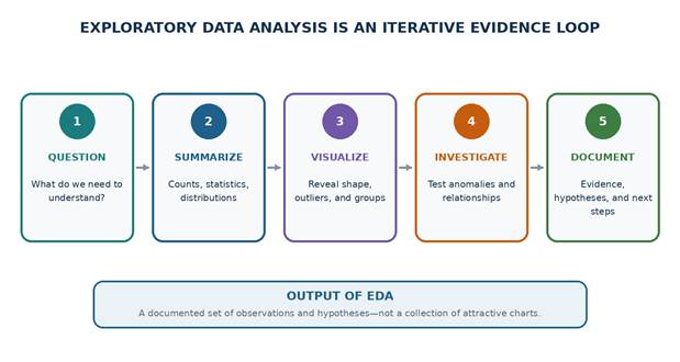
Figure 6.1 — EDA is an iterative process of questioning, summarizing, visualizing, investigating, and documenting.
6.1 Purpose of Exploratory Analysis
EDA begins after the dataset has been loaded and inspected structurally. Chapter 5 established what one row represents, which fields exist, how missing values and duplicates appear, and whether the target is available. Chapter 6 asks deeper analytical questions: What shapes do the variables have? Which values are unusual? How does the target vary across groups? Which features may be redundant, unstable, or unavailable at prediction time?
6.1.1 Understanding data distributions
A distribution describes how values are spread across the range of a variable. For numerical data, useful characteristics include location, spread, symmetry, tails, gaps, multiple modes, and concentration near boundaries. For categorical data, the distribution is represented by category frequencies and proportions. Distribution shape influences preprocessing, model choice, metric interpretation, and the reliability of summaries.
Distribution feature | What it may indicate | Possible modeling consequence |
|---|---|---|
| Strong right skew | Many typical values and a few very large values | Consider log transformation, robust metrics, or tree-based models. |
| Multiple peaks | Mixture of populations, products, or collection processes | Investigate subgroups or hidden categories. |
| Many zeros | True absence, censoring, or a special process | Use zero indicators or a two-part model where appropriate. |
| Boundary pile-up | Clipping, policy limits, or measurement saturation | Confirm whether values are censored. |
| Very rare categories | Sparse evidence or data-entry variants | Group carefully or collect more data. |
| Target imbalance | One outcome is much less frequent | Use suitable metrics, stratification, and threshold analysis. |
6.1.2 Finding data-quality issues
Initial inspection identifies obvious missing values and invalid types, but distributions often reveal less visible problems. A histogram may expose a sentinel value such as 999, a box plot may reveal unit errors, and a bar chart may show duplicated spellings of the same category. EDA should preserve these values long enough to document the evidence before cleaning decisions are applied.
CAUTION Unusual does not mean incorrect A rare value may be a valid high-value customer, an important failure case, or a genuine minority group. Confirm with domain rules and source records before removal. |
6.1.3 Detecting unusual observations
Unusual observations include statistical outliers, impossible values, rare category combinations, extreme residual candidates, and records inconsistent with the rest of their group. They may represent errors, legitimate rare cases, data-entry conventions, or a different data-generating process. Their influence should be evaluated rather than assumed.
- Check whether the value is possible according to domain constraints.
- Compare the raw record with related fields and source documentation.
- Determine whether the value is isolated or part of a subgroup.
- Assess its influence on mean, variance, correlations, and model estimates.
- Record the decision to retain, cap, transform, correct, or exclude it.
- Keep an auditable link between the cleaned observation and the raw evidence.
6.1.4 Discovering relationships
Supervised learning depends on relationships between input features and the target. EDA helps identify linear trends, monotonic associations, nonlinear patterns, group differences, thresholds, interactions, and regions with little data. It also identifies relationships among features that may indicate redundancy or unstable model coefficients.
6.1.5 Forming hypotheses
A useful exploratory observation can be converted into a testable hypothesis. For example, “Customers with month-to-month contracts appear to churn more often” can lead to a cross-validated model comparison, a controlled statistical analysis, or a domain investigation. EDA should separate observed evidence from explanatory stories.
Weak statement | Evidence-based statement |
|---|---|
| Customers hate expensive plans. | Monthly spend is higher among churned customers in this sample, but the groups also differ in contract type and tenure; the association requires conditional analysis. |
| Support calls cause churn. | The median number of support calls is higher for churned customers; this may reflect unresolved problems, but the observational data do not establish causality. |
| The Islands region is unimportant. | The Islands category contains only 2% of records, so its estimated churn rate is uncertain and should be reported with its sample size. |
| The model will use age well. | Age has broad coverage and little missingness, but the univariate relationship with churn appears weak; interactions may still be relevant. |
6.1.6 Identifying preprocessing requirements
EDA guides, but does not perform, the final preprocessing strategy. Distributional evidence may suggest robust scaling, transformation of skewed features, category consolidation, missingness indicators, date-derived variables, interaction terms, or exclusion of leakage variables. These transformations must later be fitted within the training pipeline to avoid leakage.
EDA evidence | Possible preprocessing requirement |
|---|---|
| Strongly skewed positive numeric variable | Log or power transform; robust scaling; tree-based candidate. |
| Different units and scales | Standardization for distance- or gradient-based models. |
| Missingness concentrated in a subgroup | Missingness indicator and domain investigation. |
| Rare category levels | Consolidation based on training data or an infrequent-category encoder. |
| Near-duplicate variables | Feature removal, regularization, or dimensionality reduction. |
| Nonlinear feature–target trend | Transformation, splines, bins, or nonlinear model family. |
| Post-event feature | Remove before any model evaluation. |
| Repeated entities | Use group-aware splitting and entity-level summaries where appropriate. |
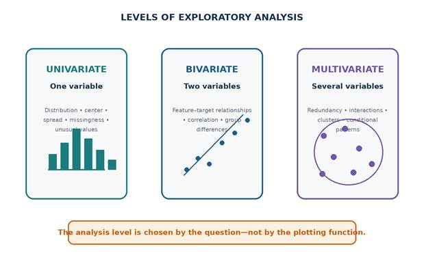
Figure 6.2 — Univariate, bivariate, and multivariate analysis answer progressively richer questions.
6.1.7 Preparing a reproducible EDA workspace
A notebook should make its source, target, plotting conventions, and random state explicit. Avoid hidden state: restart the kernel and run all cells before submission. The following setup loads the running dataset created for this chapter.
PYTHON • EXAMPLE 6.1 — LOAD AND PREPARE THE RUNNING DATASET from pathlib import Path Keep exploratory transformations in new variables or columns until their meaning and impact are documented. |
6.1.8 Classify variables before plotting
Pandas data types do not fully describe analytical roles. An integer may be a count, an ordinal code, an identifier, or a binary label. Explicit variable groups make later summaries auditable and prevent inappropriate calculations such as averaging identifiers.
PYTHON • EXAMPLE 6.2 — DEFINE ANALYTICAL VARIABLE GROUPS identifier_cols = ["customer_id"] Analytical grouping is a data-dictionary decision, not merely a dtype selection. |
6.2 Univariate Analysis
Univariate analysis studies one variable at a time. It establishes basic plausibility, distribution shape, missingness, category balance, and potential anomalies. Univariate summaries are necessary but insufficient: a variable that appears reasonable alone may still contain leakage or behave differently across target groups.
6.2.1 Numerical variables: measures of center
The mean is the arithmetic average and uses every value. The median is the middle ordered value and is less sensitive to extreme observations. When a distribution is symmetric and free of extreme values, mean and median are often similar. A large difference suggests skewness, outliers, or multiple populations.
Measure | Definition | Strength | Limitation |
|---|---|---|---|
| Mean | Sum of values divided by count | Uses all observations; useful for additive quantities | Sensitive to extreme values and skewness. |
| Median | 50th percentile | Robust to extreme values | Does not reflect the magnitude of tails. |
| Mode | Most frequent value | Useful for categories or discrete values | May be absent or have multiple values. |
For values x₁, x₂, …, xₙ, the sample mean is x̄ = (1/n) Σxᵢ. The median is determined by ordering the observations and locating the central position.
6.2.2 Minimum, maximum, and range
The minimum and maximum define the observed boundaries; the range is maximum minus minimum. These summaries are easy to interpret but depend completely on the most extreme values. They should always be compared with domain limits and sample size.
6.2.3 Variance and standard deviation
Variance measures the average squared deviation from the mean. The sample variance uses n−1 in the denominator, while the standard deviation is its square root and therefore has the same units as the original variable. Both are sensitive to outliers. The interquartile range provides a more robust measure of spread.
Sample variance: s² = [1/(n−1)] Σ(xᵢ − x̄)². Sample standard deviation: s = √s².
6.2.4 Quantiles and interquartile range
A quantile is a value below which a specified proportion of observations falls. The 25th, 50th, and 75th percentiles are commonly denoted Q1, median, and Q3. The interquartile range is IQR = Q3 − Q1. The common 1.5×IQR rule flags observations below Q1 − 1.5IQR or above Q3 + 1.5IQR, but it does not prove that those observations are erroneous.
PYTHON • EXAMPLE 6.3 — PRODUCE A NUMERICAL SUMMARY TABLE summary = df[numeric_cols].describe( Percentiles near the tails can be more informative than only minimum and maximum for large datasets. |
6.2.5 Robust outlier screening
PYTHON • EXAMPLE 6.4 — FLAG VALUES OUTSIDE THE IQR FENCES def iqr_outlier_report(series: pd.Series) -> dict: Treat the result as a review list. Domain validity and influence matter more than the mechanical flag. |
6.2.6 Histograms
A histogram divides a numerical range into bins and counts observations in each bin. It helps reveal symmetry, skewness, gaps, multiple peaks, boundary effects, and long tails. Its appearance depends on bin width: too few bins hide structure; too many create noisy detail. Inspect several reasonable bin choices or use a principled rule.
PYTHON • EXAMPLE 6.5 — PLOT NUMERICAL HISTOGRAMS plot_columns = [ Use the same cleaned subset only when comparisons require it; otherwise show missingness separately rather than silently dropping different rows. |
6.2.7 Box plots
A box plot summarizes the median, quartiles, interquartile range, and observations beyond the whiskers. It is compact and useful for group comparisons, but it hides detailed distribution shape. Combine it with a histogram, density plot, or raw-point sample when possible.
PYTHON • EXAMPLE 6.6 — CREATE COMPARABLE BOX PLOTS columns = [ Variables with very different scales should use separate axes; a single shared scale can make small-range variables unreadable. |
6.2.8 Skewness
Skewness measures asymmetry. Positive skew indicates a longer right tail; negative skew indicates a longer left tail. A value near zero does not guarantee normality, and thresholds such as |skew| > 1 are heuristics rather than universal rules. Sample size, outliers, and bounded variables must be considered.
Observed skewness | Typical interpretation | Possible response |
|---|---|---|
| Near zero | Approximately symmetric | No transformation required solely for symmetry. |
| Moderately positive | Right tail with larger values | Inspect outliers; consider log1p for nonnegative data. |
| Strongly positive | Extreme right tail or mixture | Investigate units, subgroups, and robust methods. |
| Negative | Longer lower tail | Inspect lower boundary, truncation, or reflected transformation. |
| Discrete count with many zeros | Zero inflation or rare events | Consider indicators, count models, or tree methods. |
PYTHON • EXAMPLE 6.7 — COMPARE RAW AND LOG-TRANSFORMED SKEWNESS spend = df["monthly_spend"] A transformation should be justified by model needs and interpretability, then fitted inside the training pipeline. |
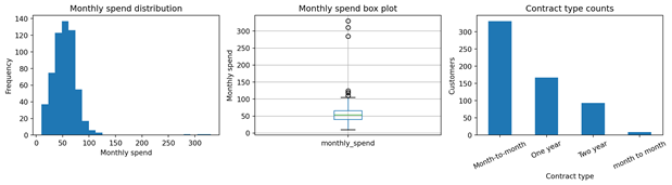
Figure 6.3 — Complementary univariate views: histogram, box plot, and categorical count chart.
6.2.9 Categorical variables: counts and proportions
Category counts show how much evidence is available for each level. Proportions make comparisons easier across datasets of different size. Missing values should be included explicitly during EDA because they may represent an important process rather than random absence.
PYTHON • EXAMPLE 6.8 — COUNT AND PROPORTION CATEGORICAL VALUES def categorical_summary(series: pd.Series) -> pd.DataFrame: Use dropna=False so that missing categories remain visible in the denominator and report. |
6.2.10 Rare categories
A rare category has few observations relative to the modeling task. Rare levels can lead to unstable estimates, unseen categories in validation or production, and misleading target rates. A universal threshold does not exist: consider absolute count, proportion, target events, domain importance, and expected future frequency.
PYTHON • EXAMPLE 6.9 — IDENTIFY RARE CATEGORY LEVELS def rare_categories( Do not automatically merge a small but operationally important region into “Other” without domain approval. |
6.2.11 Bar charts
Bar charts display categorical counts or rates. Bars should start at zero when representing magnitude, category ordering should be intentional, and labels should show counts when small groups may otherwise look equally reliable. Avoid pie charts when many categories or precise comparison is required.
PYTHON • EXAMPLE 6.10 — PLOT CATEGORY COUNTS WITH LABELS counts = df["contract_type"].value_counts(dropna=False) Preserve raw category labels during the audit; normalize them only through a documented mapping. |
6.2.12 Univariate checklist
Question | Numerical variable | Categorical variable |
|---|---|---|
| Completeness | Missing count and percentage | Missing category count and percentage |
| Coverage | Minimum, maximum, quantiles | Number of distinct categories |
| Typical value | Mean and median | Mode and dominant proportion |
| Spread | Standard deviation and IQR | Distribution across levels |
| Shape | Histogram and skewness | Ordered count bar chart |
| Unusual values | Domain rules and outlier flags | Rare, unknown, or inconsistent labels |
| Model implication | Scaling, transformation, clipping review | Encoding, grouping, unknown handling |
6.3 Bivariate Analysis
Bivariate analysis examines two variables together. In supervised learning, the most important bivariate view often compares one feature with the target. Relationships between two features are also useful for understanding redundancy, confounding, and interactions. The choice of summary depends on the types of both variables.
Variable pair | Useful tools |
|---|---|
| Numerical feature + numerical target | Scatter plot, correlation, grouped bins, residual-oriented summaries |
| Numerical feature + categorical target | Grouped statistics, box plots, violin or distribution plots, class-wise histograms |
| Categorical feature + categorical target | Cross-tabulation, row/column proportions, target rate by category |
| Categorical feature + numerical target | Grouped mean/median, box plots, confidence intervals |
| Two categorical features | Cross-tabulation, normalized proportions, association measures |
| Two numerical features | Scatter plot, correlation, nonlinear trend inspection |
6.3.1 Feature versus target analysis
The objective is not only to find features with high marginal association. A weak univariate relationship can become useful through interaction with other features, while a very strong relationship may indicate leakage. Always ask whether the feature would be available at prediction time and whether the relationship is stable across time and subgroups.
6.3.2 Correlation between numerical variables
Pearson correlation measures linear association and ranges from −1 to +1. Values near ±1 indicate strong linear association; values near zero indicate weak linear association, not necessarily absence of a relationship. Spearman correlation uses ranks and can detect monotonic nonlinear relationships while reducing sensitivity to extreme values.
Issue | Why correlation can mislead |
|---|---|
| Nonlinearity | A U-shaped relationship may have correlation near zero. |
| Outliers | A few extreme points can create or reverse a correlation. |
| Restricted range | A narrow sample may hide a relationship present in the population. |
| Common cause | Two variables can correlate because both depend on a third variable. |
| Time trend | Variables can correlate because both increase over time. |
| Mixed groups | Combined groups may show a different trend from each subgroup. |
| Missingness | Pairwise deletion can use a different subset for each coefficient. |
PYTHON • EXAMPLE 6.11 — COMPARE PEARSON AND SPEARMAN CORRELATIONS selected = [ Inspect scatter plots and sample sizes before interpreting any coefficient. |
6.3.3 Cross-tabulation
A cross-tabulation counts combinations of two categorical variables. Raw counts reveal sample size; row-normalized percentages answer “within each feature category, what proportion belongs to each target class?” Column-normalized percentages answer a different question. State the normalization explicitly.
PYTHON • EXAMPLE 6.12 — CROSS-TABULATE A CATEGORY AND TARGET counts = pd.crosstab( Rates without counts can be unstable. Report both whenever groups are small. |
6.3.4 Grouped statistics
Grouped statistics compare center, spread, missingness, and sample size across target classes or categories. For skewed variables, report both mean and median. Include count because a large difference based on a tiny subgroup is uncertain.
PYTHON • EXAMPLE 6.13 — SUMMARIZE NUMERICAL FEATURES BY CLASS grouped = df.groupby(TARGET)[ After finding a class difference, check whether it persists within important categories or time periods. |
6.3.5 Scatter plots
A scatter plot displays two numerical variables and can reveal direction, strength, curvature, clusters, changing variance, gaps, and influential points. Use transparency for dense datasets and avoid interpreting overlapping points as absent observations. Coloring by target can help, but too many categories may obscure the pattern.
PYTHON • EXAMPLE 6.14 — INSPECT A NUMERICAL RELATIONSHIP fig, axis = plt.subplots(figsize=(7, 5)) A visible pattern may be produced by contract composition; follow up with stratified or multivariate analysis. |
6.3.6 Box plots by class
PYTHON • EXAMPLE 6.15 — COMPARE FEATURE DISTRIBUTIONS BY TARGET features = ["support_calls", "late_payments", "monthly_spend"] Compare medians, spread, overlap, and sample size; do not focus only on isolated outlier markers. |
6.3.7 Target rate by category
For a binary target encoded as 0 and 1, the group mean equals the positive-class rate. This is convenient but should be accompanied by group counts and, when decisions are important, uncertainty intervals. Unexpectedly perfect rates can indicate small groups, leakage, or target-derived categories.
PYTHON • EXAMPLE 6.16 — CALCULATE TARGET RATE WITH GROUP SIZE target_rate = ( A 100% rate based on two customers is not equivalent to a 70% rate based on two thousand customers. |
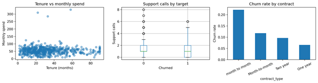
Figure 6.4 — Bivariate views reveal numerical relationships, class differences, and target rates by category.
6.4 Multivariate Considerations
Multivariate analysis considers several variables simultaneously. It is necessary because marginal relationships can change after conditioning on other variables. In practical EDA, multivariate work often focuses on correlation structure, redundant features, interactions, confounding, feature groups, and the geometry of high-dimensional data.
6.4.1 Correlation matrices
A correlation matrix summarizes pairwise numerical associations. It helps identify duplicated measurements, derived variables, clusters of related features, and candidate multicollinearity. It is not a feature-selection algorithm by itself: correlated variables may carry different operational meanings, missingness patterns, costs, or nonlinear relationships.
PYTHON • EXAMPLE 6.17 — CREATE AN ANNOTATED CORRELATION MATRIX numeric = df.select_dtypes(include="number") Large matrices become unreadable; filter to meaningful feature groups or use clustering to order variables. |
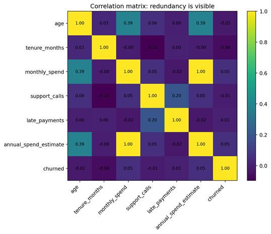
Figure 6.5 — The derived annual-spend feature is almost perfectly redundant with monthly spend.
6.4.2 Redundant features
Redundancy occurs when multiple features carry nearly the same information. Exact derivations, duplicated sensors, repeated encodings, cumulative and component values, or highly correlated measurements can increase computation and make linear-model coefficients unstable. Redundancy is not always harmful to predictive accuracy, especially for regularized or tree-based models, but it complicates interpretation and maintenance.
PYTHON • EXAMPLE 6.18 — FIND HIGHLY CORRELATED FEATURE PAIRS correlation = df[numeric_cols].corr().abs() Review the feature definitions before dropping either member of a correlated pair. |
6.4.3 Interactions between variables
An interaction means the relationship between one feature and the target depends on another feature. For example, support calls may be associated with churn mainly among month-to-month customers, while long-term contracts remain stable despite several calls. Interactions can be explored with stratified summaries, faceted plots, two-dimensional bins, or models designed to capture them.
PYTHON • EXAMPLE 6.19 — EXPLORE AN INTERACTION WITH GROUPED RATES interaction = ( A sparse cell can create an unstable interaction pattern. Always display the number of observations. |
6.4.4 Multicollinearity
Multicollinearity occurs when one predictor can be approximated by a combination of other predictors. It can make linear-model coefficients unstable, inflate standard errors, and cause coefficient signs to change across samples. Pairwise correlation detects only simple cases. A practical diagnostic is the variance inflation factor (VIF), but its threshold is heuristic and it should be interpreted with feature meaning and model purpose.
Symptom | Possible explanation | Response |
|---|---|---|
| Coefficients change sharply across folds | Predictors contain overlapping information | Use regularization, remove redundant variables, or combine them. |
| Large coefficients with weak predictive contribution | Model compensates among correlated features | Standardize, inspect VIF, and compare stability. |
| Opposite coefficient signs from domain expectation | Suppression or correlated predictors | Examine marginal and conditional relationships. |
| Feature importance split across similar variables | Several features represent the same concept | Interpret the group rather than a single variable. |
PYTHON • EXAMPLE 6.20 — ESTIMATE VIF WITH SCIKIT-LEARN from sklearn.linear_model import LinearRegression This demonstration estimates VIF on one dataset. In a final workflow, diagnostics must be computed using training data only. |
6.4.5 High-dimensional data
High-dimensional datasets contain many features relative to observations. Individual plots become impractical, distances can become less informative, and chance correlations multiply. Useful strategies include grouping features by domain, examining missingness and variance, clustering correlations, dimensionality reduction for visualization, and maintaining strict validation to avoid selection bias.
- Start with a data dictionary and domain-based feature families.
- Remove constant, near-constant, duplicated, and obviously leaked variables.
- Summarize distributions programmatically rather than manually plotting every column.
- Use correlation clustering to identify related groups.
- Use PCA or another projection for exploratory visualization, not as proof of separability.
- Perform feature selection inside cross-validation rather than on the full dataset.
- Record how many hypotheses and comparisons were explored.
6.4.6 Feature clusters
Feature clusters are groups of variables that measure a related concept or move together. Examples include financial activity, service usage, sensor vibration bands, or image texture descriptors. Clusters help organize EDA, simplify interpretation, identify redundant measurements, and design grouped ablation studies.
PYTHON • EXAMPLE 6.21 — ORDER FEATURES BY HIERARCHICAL CORRELATION CLUSTERING from scipy.cluster.hierarchy import linkage, leaves_list SciPy is optional. The objective is to organize related variables, not to treat clusters as definitive scientific constructs. |
6.5 Detecting Suspicious Patterns
The most dangerous exploratory pattern is not always a weak relationship; it may be an implausibly strong one. A feature that directly reveals the target, identifies a duplicated entity across train and test, or contains information recorded after the prediction time can produce excellent validation results that fail in production. Suspicion should increase when performance appears too good for the domain.
6.5.1 Variables that directly reveal the target
A target-revealing feature may be an explicit copy, an alternative label, a status code derived from the outcome, or an administrative field updated after the decision. Examples include claim_paid when predicting claim approval, cancellation_reason when predicting cancellation, or discharge_status when predicting whether a patient will be discharged.
PYTHON • EXAMPLE 6.22 — SCREEN CATEGORIES FOR NEAR-PERFECT TARGET SEPARATION def target_rate_screen( Perfect target rates are a review trigger, not automatic proof of leakage; sample size and process timing must be checked. |
6.5.2 Identifier columns
Identifiers usually describe identity rather than reusable predictive structure. A model may memorize customer, hospital, device, postcode, or transaction IDs when entities repeat or when IDs encode time or location. High-cardinality identifiers can also produce misleading feature importance. Retain them for joins, auditing, and group-aware splitting, but exclude them from ordinary model features unless a justified transformation exists.
PYTHON • EXAMPLE 6.23 — REVIEW IDENTIFIER CARDINALITY AND REPETITION identifier_report = pd.DataFrame({ A uniqueness ratio near 1 suggests an identifier, but free-text fields and continuous measurements can also be unique. |
6.5.3 Post-event information
Post-event information is created after the outcome or after the time at which the prediction is required. It may be highly predictive because it describes the consequences of the event. The correct test is temporal and operational: would this exact value exist and be accessible at the scoring time?
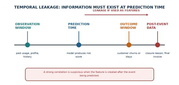
Figure 6.6 — Features must be restricted to information available by the prediction timestamp.
6.5.4 Duplicate entities
Multiple rows per entity are not necessarily duplicates. They may be visits, transactions, images, machine cycles, or time windows. However, records from the same entity can create leakage if they are split randomly across training and testing sets. EDA must measure rows per entity and determine whether observations are independent.
PYTHON • EXAMPLE 6.24 — EXAMINE ROWS PER ENTITY rows_per_customer = ( When entities repeat, consider GroupShuffleSplit, GroupKFold, or a time-aware entity split. |
6.5.5 Unexpectedly perfect correlations
A perfect or near-perfect correlation can result from duplicate fields, unit conversions, derived totals, copied targets, or deterministic business rules. It may be valid but redundant, or it may expose a pipeline error. Examine formulas and timestamps rather than simply dropping one column.
PYTHON • EXAMPLE 6.25 — SCREEN NUMERICAL FEATURES FOR EXTREME TARGET CORRELATION target_correlations = ( For a binary target, linear correlation is only one screening tool; categorical and nonlinear leakage may not appear here. |
6.5.6 Data collected after the predicted event
Timestamp analysis should compare feature creation time, event time, data ingestion time, and prediction time. Aggregations must use only the historical window available at each prediction. A rolling feature calculated with a centered window or a full-period total may accidentally include future observations.
PYTHON • EXAMPLE 6.26 — VALIDATE FEATURE TIMESTAMPS required_time_columns = [ The events DataFrame is conceptual; adapt field names to the project’s temporal specification. |
6.5.7 Suspicion checklist
Signal | Why it is suspicious | Investigation |
|---|---|---|
| Feature name contains outcome language | May be target-derived or post-event | Trace source definition and creation timestamp. |
| Category has exactly 0% or 100% target rate | May separate outcome deterministically | Check count, process rule, and availability time. |
| Validation is almost perfect immediately | Problem may be trivial, duplicated, or leaked | Audit splits, duplicates, features, and target construction. |
| Identifier ranks as most important | Model may memorize entities or time/order | Remove raw ID; use group-aware validation. |
| Two variables correlate at nearly 1 | Duplicate, conversion, or deterministic derivation | Review formulas, units, and source lineage. |
| Future-period totals appear as predictors | Aggregation may cross prediction cutoff | Recompute features with historical windows only. |
| Same image, patient, or machine appears in both sets | Entity leakage inflates generalization | Split by group before any preprocessing. |
| Unexpected timestamp ordering | Clock, join, or event-definition problem | Validate timezone, event time, and ingestion time. |
Writing Evidence-Based EDA Observations
The practical value of EDA depends on communication. A chart without a written conclusion is easy to misread, while a conclusion without evidence is difficult to verify. Each observation should include the measured evidence, a cautious interpretation, the modeling or data-quality implication, and the next action.
Component | Question answered | Example |
|---|---|---|
| Evidence | What exactly was observed? | Monthly spend has median 55, 99th percentile 118, and three values above 280. |
| Interpretation | What might explain it? | The extreme values may be unit errors or a premium customer segment. |
| Implication | Why does it matter? | Mean, variance, and linear-model scaling are strongly affected. |
| Next action | What should happen next? | Verify the three records and compare model results with robust preprocessing. |
GOOD PRACTICE Avoid causal wording Use “is associated with,” “differs in this sample,” or “appears higher” unless the study design supports causal inference. |
Five example observations from the running dataset
1. Monthly spend is right-skewed and contains three values above 280, while most customers are below approximately 120. These records should be verified before deciding whether to retain, cap, or transform the feature.
2. Month-to-month contracts are the largest contract group and have a higher observed churn rate than one-year and two-year contracts. The result should be reported with group counts and checked across tenure bands.
3. Support calls and late payments are both higher among churned customers, but their distributions overlap substantially. They may provide predictive information without being individually decisive.
4. annual_spend_estimate is deterministically derived from monthly_spend and therefore contributes almost no independent information. Retaining both may complicate coefficient interpretation.
5. post_churn_closure_code nearly determines the target because it is recorded after account closure. It is a leakage variable and must be excluded before validation or model training.
A reusable observation template
PYTHON • EXAMPLE 6.27 — STORE OBSERVATIONS AS A STRUCTURED TABLE observations = pd.DataFrame([ A structured log makes exploratory decisions auditable and easy to revisit after domain review. |
Practical Lab — Exploratory Analysis and Five Evidence-Based Observations
PRACTICAL LAB Lab objective Students perform a complete exploratory analysis of a supervised-learning dataset and submit at least five observations supported by numerical or visual evidence. |
Lab scenario
A subscription company wants to predict whether an active customer will churn during the next observation period. The data team has provided customer profile, contract, service, payment, and target fields. Before preprocessing or modeling, students must characterize the dataset, identify suspicious variables, and determine which findings require domain confirmation.
Student tasks
1. Load the dataset reproducibly and restate the unit of observation and target definition.
2. Classify columns as identifiers, numerical features, categorical features, target, timestamps, and suspicious or excluded fields.
3. Produce numerical summaries including missingness, mean, median, minimum, maximum, standard deviation, quantiles, and skewness.
4. Create histograms and box plots for numerical variables and interpret at least two unusual distributions.
5. Produce category counts, proportions, rare-category flags, and bar charts for categorical variables.
6. Analyze each candidate feature against the target using appropriate grouped statistics, cross-tabulations, scatter plots, box plots, or target rates.
7. Create and interpret a correlation matrix; identify redundant or strongly related features.
8. Investigate at least one possible interaction between two features.
9. Audit identifiers, duplicated entities, target-derived variables, and temporal availability for leakage.
10. Write five evidence-based observations using evidence, interpretation, implication, and next action.
11. Save summary tables and figures to a reports directory without overwriting the raw data.
Step 1 — Load and validate the dataset
PYTHON • EXAMPLE 6.28 — LAB SETUP AND STRUCTURAL VALIDATION from pathlib import Path Do not remove suspicious columns yet; retain them for the leakage audit and explicitly mark them as excluded from modeling. |
Step 2 — Generate a compact univariate report
PYTHON • EXAMPLE 6.29 — BUILD NUMERICAL AND CATEGORICAL REPORTS numeric_report = lab_df[numeric_cols].describe().T Functions and variable groups may be defined in earlier notebook cells; the final notebook must run from top to bottom. |
Step 3 — Create target-oriented summaries
PYTHON • EXAMPLE 6.30 — PRODUCE FEATURE–TARGET EVIDENCE TABLES numeric_by_target = lab_df.groupby(TARGET)[numeric_cols].agg( Target rates should be interpreted together with sample size and category quality. |
Step 4 — Run the suspicious-pattern audit
PYTHON • EXAMPLE 6.31 — CREATE A LEAKAGE REVIEW TABLE leakage_review = pd.DataFrame([ The table should be extended with every project-specific timestamp, identifier, and outcome-adjacent feature. |
Step 5 — Write the required observations
Observation ID | Evidence | Interpretation | Implication | Next action |
|---|---|---|---|---|
| EDA-01 | Statistic, count, or plotted pattern | Cautious explanation | Why it matters to data or model | Verification or analysis step |
| EDA-02 | Statistic, count, or plotted pattern | Cautious explanation | Why it matters to data or model | Verification or analysis step |
| EDA-03 | Statistic, count, or plotted pattern | Cautious explanation | Why it matters to data or model | Verification or analysis step |
| EDA-04 | Statistic, count, or plotted pattern | Cautious explanation | Why it matters to data or model | Verification or analysis step |
| EDA-05 | Statistic, count, or plotted pattern | Cautious explanation | Why it matters to data or model | Verification or analysis step |
Expected deliverable
- A Jupyter notebook that runs from a clean kernel without manual intervention.
- A short dataset context statement, unit of observation, target definition, and feature-role table.
- Numerical summary tables with center, spread, quantiles, missingness, and skewness.
- Categorical distribution tables with counts, proportions, and rare-category evidence.
- At least six readable visualizations covering univariate, bivariate, and multivariate questions.
- Feature–target analysis appropriate to the data types.
- A correlation and redundancy review.
- A leakage and duplicate-entity audit.
- Five evidence-based observations with next actions.
- Saved report tables and figures, plus a short conclusion describing preprocessing requirements.
Suggested grading rubric
Criterion | Excellent evidence | Needs improvement | Weight |
|---|---|---|---|
| Reproducibility | Notebook runs cleanly; paths, groups, target, and report outputs are explicit. | Hidden state, manual edits, or missing dependencies. | 15% |
| Univariate analysis | Correct statistics and plots; missingness, shape, and anomalies are interpreted. | Charts are produced without interpretation or inappropriate statistics are used. | 20% |
| Bivariate analysis | Feature–target tools match data types; counts and rates are both reported. | Only correlation is used or small-group uncertainty is ignored. | 20% |
| Multivariate analysis | Redundancy, interactions, and high-dimensional considerations are addressed. | Correlation matrix is shown without interpretation. | 15% |
| Suspicious-pattern audit | Identifiers, duplicates, post-event data, and leakage are explicitly reviewed. | Potential leakage is ignored. | 15% |
| Evidence-based observations | Five clear observations distinguish evidence, interpretation, implication, and action. | Claims are vague, causal, or unsupported. | 15% |
Chapter Summary
Exploratory data analysis transforms a structurally inspected dataset into an evidence-based understanding of distributions, unusual observations, relationships, redundancy, and modeling risks. Univariate analysis describes one variable through measures of center, spread, quantiles, shape, counts, proportions, and visualizations. Bivariate analysis examines feature–target and feature–feature relationships using grouped summaries, cross-tabulations, correlations, scatter plots, box plots, and target rates. Multivariate analysis considers redundancy, interactions, multicollinearity, high-dimensional structure, and clusters of related features.
EDA also serves as a defense against invalid evaluation. Identifiers, post-event variables, duplicate entities, deterministic target proxies, and future information can produce deceptive performance. The final output of EDA is not simply a notebook of plots; it is a documented set of observations, hypotheses, risks, and preprocessing requirements that can be tested in a leakage-safe modeling pipeline.
Key terminology
Term | Meaning |
|---|---|
| Exploratory data analysis | Iterative examination of data using summaries, visualizations, and domain reasoning before formal modeling. |
| Distribution | How values or categories are spread across their possible range. |
| Quantile | A value below which a specified proportion of observations falls. |
| Interquartile range | Q3 − Q1; the spread of the middle 50% of observations. |
| Skewness | A measure of distribution asymmetry. |
| Cross-tabulation | A table of counts or proportions for combinations of categorical values. |
| Correlation | A standardized measure of association; Pearson correlation measures linear association. |
| Interaction | A relationship in which the effect of one feature depends on another feature. |
| Multicollinearity | Strong dependence among predictors that can destabilize coefficient estimates. |
| Rare category | A category represented by relatively few observations or target events. |
| Target leakage | Use of information that would not be legitimately available when the prediction is made. |
| Evidence-based observation | A statement containing measured evidence, cautious interpretation, implication, and next action. |
Knowledge check
1. Why should mean and median be compared for a numerical variable?
2. What information does a box plot hide that a histogram may reveal?
3. Why is an IQR outlier flag not a deletion rule?
4. What is the difference between category counts and target rate by category?
5. Why can correlation near zero coexist with a strong relationship?
6. When is Spearman correlation more informative than Pearson correlation?
7. Why should target rates always be accompanied by group counts?
8. How can repeated entities inflate validation performance?
9. Why is a post-event field dangerous even if it has no missing values?
10. What makes an EDA observation evidence-based rather than speculative?
Suggested answers
1. A difference between them can reveal skewness, extreme observations, or mixed populations because the mean is more sensitive to tails.
2. A box plot hides detailed shape such as multiple modes, gaps, and local concentration; a histogram can reveal these patterns.
3. The rule identifies statistical extremeness, not invalidity. Domain meaning, source evidence, and influence must be evaluated.
4. Counts describe how common categories are; target rates describe the proportion of positive outcomes within each category.
5. Pearson correlation measures only linear association; curved or U-shaped relationships may have a coefficient near zero.
6. Spearman is useful for monotonic nonlinear relationships, ordinal data, or situations where ranks are more robust to extreme values.
7. A rate estimated from a small group is uncertain and may look extreme by chance.
8. Rows from the same entity can appear in both training and testing sets, allowing the model to recognize entity-specific patterns rather than generalize.
9. It may encode consequences of the outcome and would not exist at prediction time, causing target leakage.
10. It states measured evidence, distinguishes interpretation from fact, explains the implication, and identifies a concrete next action.
Instructor notes and suggested timing
Session | Focus | Suggested activities | Duration |
|---|---|---|---|
| 1 | Purpose and univariate statistics | Discuss EDA goals; calculate center, spread, quantiles, and skewness. | 120 min |
| 2 | Univariate visualization | Create and interpret histograms, box plots, counts, and bar charts. | 120 min |
| 3 | Bivariate analysis | Use grouped summaries, cross-tabs, scatter plots, box plots, and target rates. | 150 min |
| 4 | Multivariate structure | Interpret correlation matrices, redundancy, interactions, and multicollinearity. | 120 min |
| 5 | Suspicious-pattern audit | Review identifiers, duplicate entities, target proxies, and temporal leakage. | 90 min |
| 6 | Guided practical lab | Complete EDA and write five evidence-based observations. | 180 min |
| 7 | Peer review | Challenge interpretations, causal wording, and next actions. | 90 min |
Readiness check before Chapter 7
- I can describe every numerical and categorical feature using appropriate statistics and visualizations.
- I can distinguish a domain-invalid value from a statistical outlier flag.
- I report group counts together with target rates and other group summaries.
- I interpret correlation as association rather than causation.
- I have identified redundant features, possible interactions, and multicollinearity risks.
- I have audited identifiers, repeated entities, post-event fields, and feature timestamps for leakage.
- I can state at least five evidence-based observations and corresponding next actions.
- I know which preprocessing requirements must be implemented later inside a training pipeline.
KEY IDEA Next step Chapter 7 will translate the EDA evidence into explicit data-cleaning decisions for missing values, duplicates, inconsistencies, and outliers while preserving reproducibility and avoiding leakage. |